Friday, February 20, 2015

Weekly Blog Post

The monster logo is kind of alright I guess.  I was never a huge fan of the font or placement of type.  I don't particularly like the color of yellow they use either, but I like the drink.  So I buy it.

I always liked the trident logo.  It's neat and original and easily identifiable.  The layers part could use some work.  It's trajan pro esque and too spaced apart for my liking.

The febreze logo is exactly what you'd expect.  Simple, slim, neat.  Everything you could want in a product designed to keep your house smelling like a house and not a barn.  

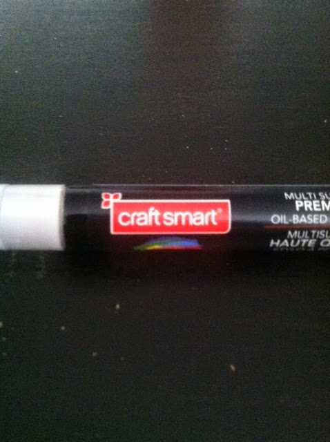
This i a little logo I found on one of my paint pens the other day.  How old could this possible be?  It's so awful.  And what is that little icon in the corner?

This Djeep logo is actually kind of nice.  Not what I would expect out of a cheap little lighter.  The dark black draws your attention away from the blue background and towards the logo, and it's close together, making it easy to read.  

Wednesday, February 18, 2015

Friday, February 13, 2015

Weekly Post
This would be the logo of the store I work for called Giant.  it's completely old, and outdated.  The lettering is blocky and hard to read.  The logo itself is unrecognizable and doesn't stand out very well.  Maybe I'm just biased having worked there for so long.

This I found in a PetCo store.  I thought it was adorable so I snapped a quick picture.  I love the antlers, and how the type is still easy to read even though it's so decorative.  I like the varying fonts and contrasting colors as well.  


This Is a logo I saw on a prop bottle of health potion.  I thought it was cute, and suited the old timey look that the glass itself had.  In certain situations, changing the style of type is often necessary to stay with the theme of whatever it belongs to.  

Monday, February 9, 2015

Emil Rudolf Weiss

Emil Rudolf Weiss

Emil Rudolf Weiss was a very talented man who lived as a german designer and illustrator in the early 1900’s.  He was born in 1875 and died at the age of 67 in 1942.  There was a book about him published in 1931.  It was called “Der Schrift und Buchkünstler Emil Rudolph Weiß”.  It was a book about the broad scope of his works ranging from illustration to type.  

His work seems very medieval in nature and represents everything a dark german folktale would need with it’s font. Think Brother’s Grim.  Although it seems he’s designed fonts for churches and religious works as well.  Many of the names within his book are religious figures, such as St. John and St. Michael.  His illustrations are very archaic as well, even for the time period he lived in.  Which I’m not saying is wrong by any means, it’s just interesting.  As a personal note, I love ancient looking type, so this was an enjoyable project for me.  

It becomes a bit hard to tell what exactly he’s doing work for, as much of what’s written in within is in German.  Sadly that’s a language that is lost on me.  After doing some more research on him I found out that he was a teacher as well.  He was the king of gothic bold type, and most of his work showed that.  

The logos he has done are also pretty obviously gothic in nature.  Most of them are portrayed in simple line and bold strokes.  A great many of them are circular in nature, like seals or symbols.  The other half are more like a coat of arms, including a vast array of German symbols such as winged lions and griffons.

He made several fonts, two of which being Weiss Roman and Weiss Fraktur.  History dictates that he was a teacher as well, showing his techniques to many students over his lifetime.  

http://opentype.info/blog/2012/09/24/emil-rudolph-weiss/
http://luc.devroye.org/fonts-26202.html
http://www.identifont.com/show?6PS


Thursday, February 5, 2015

Summary on Week 3

What I Learned This Week

This Week I finally learned the difference between tracking and kerning.  Kerning is the spacing between two letters while tracking is the spacing between a whole word or sentence.  I always knew that leading was the spacing between lines of type.  I've also learned what all of the extra bits on serif fonts are called.  Finally I got tips on how to create an even amount of white space within an image.

Tuesday, February 3, 2015

Fourth Assignment 


For this assignment we were given a couple of paragraphs of text and told to align them accordingly.  One left justified, one right justified, one center justified, and one evenly aligned.  We were told to italicize certain words within the paragraphs and play with caps in certain parts to emphasize certain points.