Weekly Blog Post
The monster logo is kind of alright I guess. I was never a huge fan of the font or placement of type. I don't particularly like the color of yellow they use either, but I like the drink. So I buy it.
I always liked the trident logo. It's neat and original and easily identifiable. The layers part could use some work. It's trajan pro esque and too spaced apart for my liking.
The febreze logo is exactly what you'd expect. Simple, slim, neat. Everything you could want in a product designed to keep your house smelling like a house and not a barn.
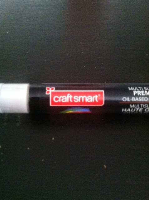
This i a little logo I found on one of my paint pens the other day. How old could this possible be? It's so awful. And what is that little icon in the corner?
This Djeep logo is actually kind of nice. Not what I would expect out of a cheap little lighter. The dark black draws your attention away from the blue background and towards the logo, and it's close together, making it easy to read.


No comments:
Post a Comment