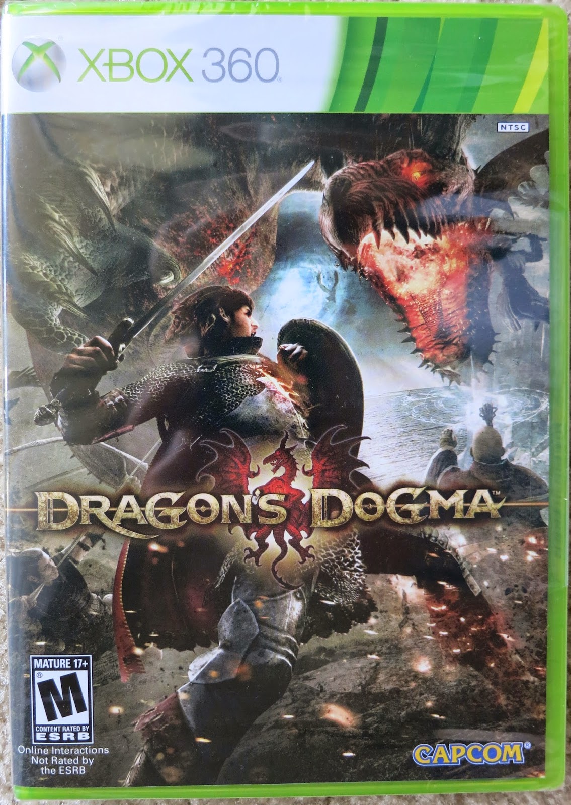
I always thought that video games had interesting examples of typography. The fantasy elements allow for some extremes that more conservative items wouldn't be able to pull off. What I like about the Dragon Age logo is that it's simple enough to read even though it's in all caps.
Dying light is a completely different example of typography in video games. The text is grungy, and scary. It tells you that the game is going to be a tough one with all the jump scares and suspenseful chases.
I actually never liked the Assassin's Creed font. It's hard to read and they put everything way too close together. It doesn't fit the pirate motif of the game
This Dragon's Dogma. It's a Japanese game, and you can almost tell just by looking at the typography. The placement is a little strange and unorthodox, and the in your face design is a bit confusing to people not accustomed to so much going on.
This is the logo for my old college. I appreciate the sense of detail put into the type, but never cared for the greek looking lady.


No comments:
Post a Comment