Thursday, April 30, 2015

Weekly Blog

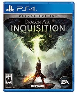
I always thought that video games had interesting examples of typography.  The fantasy elements allow for some extremes that more conservative items wouldn't be able to pull off.  What I like about the Dragon Age logo is that it's simple enough to read even though it's in all caps. 

Dying light is a completely different example of typography in video games.  The text is grungy, and scary.  It tells you that the game is going to be a tough one with all the jump scares and suspenseful chases.  

I actually never liked the Assassin's Creed font.  It's hard to read and they put everything way too close together.  It doesn't fit the pirate motif of the game 

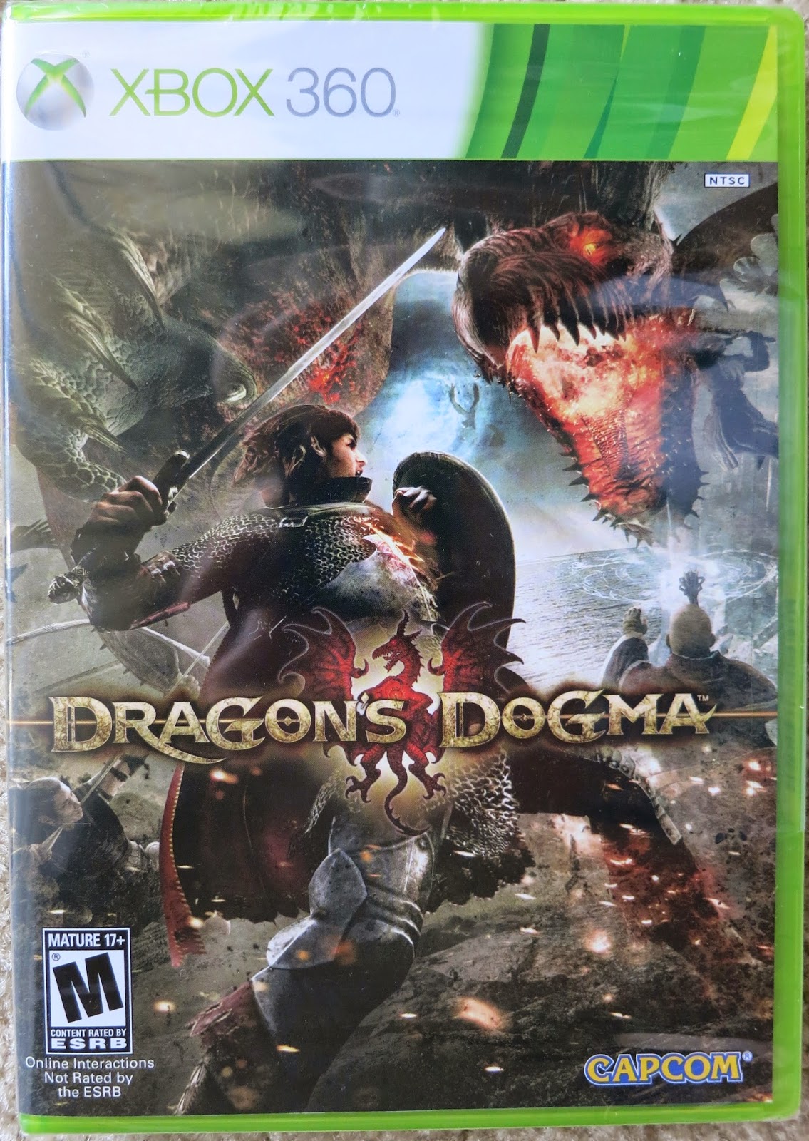
This Dragon's Dogma.  It's a Japanese game, and you can almost tell just by looking at the typography.  The placement is a little strange and unorthodox, and the in your face design is a bit confusing to people not accustomed to so much going on.

This is the logo for my old college.  I appreciate the sense of detail put into the type, but never cared for the greek looking lady.  

Thursday, April 16, 2015

Weekly Blog


Weekly Blog

This is a superworms container.  It's literally actually filled with superworms.  They're for my lizard but from a design standpoint it's kind of childish but it works.  I know that there's worms in there and I don't think my bearded dragon cares.

The Reese's logo is definitely a classic.  I know for a fact it's been around a long time and I don't think it needs any changing.  Sure it's a little retro, but like Coca Cola it's a classic. 

This is the htc logo for my phone.  I always kind of liked this logo because it looked so technologically savvy.  It's simple and blocky and reminds me of technology.  The sleek black color also helps.

This is the Skippy logo.  It's honestly a bit stuck in the 90's, but it's kid oriented and succeeds in getting their attention, so that's always something to consider.

These taquitos have a really sad box.  Really sad.  The font is way too typical, not colorful enough, and hardly appetizing.  There's nothing about this font that says "eat these they're good!"  Which is a shame.

Thursday, April 9, 2015

Weekly Blog

Weekly Blog


This is the Bounty logo on a group of paper towels.  I always thought it was eye catching and not too in your face, which is nice.  They do use a bit too much color with their logo, however, distracting you from their brand.  


I always thought the Kirkland logo was awful.  Literally terrible.  It's just type in a box, why hasn't anyone tried to fix this in the last century?  The type besides the logo is well placed and nice to look at, I wish they would follow suit.  


This candy bar looks like a child made it.  I'm not kidding, I don't know who picked out this type.  Whoever they are, however, seems to exist in the 90's.  It's crunchy alright, crunchy something.  


I always thought that for an amusement park/candy/everything franchise, Hershey park would be better at typography.  They are not.  I really do not know what else to say here.


Gamestop always had a nice logo to me.  Easy to read, eye catching, simple, not too distracting.  Also the games inside help my opinion.  


I like how they keep cropping up on this chick in the starbucks logo.  On a typography note, however, the font is easy to read and bold.  I like how the white goes along with the green.  Usually I don't.

Thursday, April 2, 2015


 In this example of typography you see the Khol's Logo.  I think it's absolutely horrific.  It's the most basic awful thing I think I've ever seen and to make it worse they just decided to plop it in a box.


In this example of typography you see how you put out a fire.   The type is very bold and pronounced, making it easy to read in chaotic situations.  I think that this is a good example of typography


In this example of typography you see the Wawa logo, which I've always liked.  I like the goose and I like the boldness of the type itself.  I may not like the Iced Tea font itself, but the Wawa logo is nice


In this example of typography, you see a crossing sign.  The type is bold and easy to read, it's also black on a yellow background, making it stand out significantly 

Wednesday, March 25, 2015

Bad Typography Weekly

Bad Typography Weekly


In this example of bad typography, it is completely obvious that the idea behind the logo can be misconstrued.  It reads as "Kid sex change," rather than "Kids Exchange."  The rainbow letters are childish and fun, however the context...


In this example of bad typography, it's pretty obvious that the word "ice" can be misread as "mice" with the McDonalds logo there.  I don't know how no one could see their blunder in this one.  It's painfully obvious that it would read as the word mice.


In this example of bad typography, the school sign is completely misread from a distance,  The flag pole blocks parts of the title, making it appear as if it reads "Spanish for Highschool."  I suppose the misread message could be seen as racist.


Mo's Elegant Hair Boutique is actually pretty stylish.  If you take away the fact that it reads as "Ho's Elegant Hair Boutique."  


Weston Public Schools could easily be read as Weston Pubic Schools.   Which is awfully offensive considering kids go there.  

Friday, February 20, 2015

Weekly Blog Post

The monster logo is kind of alright I guess.  I was never a huge fan of the font or placement of type.  I don't particularly like the color of yellow they use either, but I like the drink.  So I buy it.

I always liked the trident logo.  It's neat and original and easily identifiable.  The layers part could use some work.  It's trajan pro esque and too spaced apart for my liking.

The febreze logo is exactly what you'd expect.  Simple, slim, neat.  Everything you could want in a product designed to keep your house smelling like a house and not a barn.  

This i a little logo I found on one of my paint pens the other day.  How old could this possible be?  It's so awful.  And what is that little icon in the corner?

This Djeep logo is actually kind of nice.  Not what I would expect out of a cheap little lighter.  The dark black draws your attention away from the blue background and towards the logo, and it's close together, making it easy to read.  

Wednesday, February 18, 2015

Friday, February 13, 2015

Weekly Post
This would be the logo of the store I work for called Giant.  it's completely old, and outdated.  The lettering is blocky and hard to read.  The logo itself is unrecognizable and doesn't stand out very well.  Maybe I'm just biased having worked there for so long.

This I found in a PetCo store.  I thought it was adorable so I snapped a quick picture.  I love the antlers, and how the type is still easy to read even though it's so decorative.  I like the varying fonts and contrasting colors as well.  


This Is a logo I saw on a prop bottle of health potion.  I thought it was cute, and suited the old timey look that the glass itself had.  In certain situations, changing the style of type is often necessary to stay with the theme of whatever it belongs to.  

Monday, February 9, 2015

Emil Rudolf Weiss

Emil Rudolf Weiss

Emil Rudolf Weiss was a very talented man who lived as a german designer and illustrator in the early 1900’s.  He was born in 1875 and died at the age of 67 in 1942.  There was a book about him published in 1931.  It was called “Der Schrift und Buchkünstler Emil Rudolph Weiß”.  It was a book about the broad scope of his works ranging from illustration to type.  

His work seems very medieval in nature and represents everything a dark german folktale would need with it’s font. Think Brother’s Grim.  Although it seems he’s designed fonts for churches and religious works as well.  Many of the names within his book are religious figures, such as St. John and St. Michael.  His illustrations are very archaic as well, even for the time period he lived in.  Which I’m not saying is wrong by any means, it’s just interesting.  As a personal note, I love ancient looking type, so this was an enjoyable project for me.  

It becomes a bit hard to tell what exactly he’s doing work for, as much of what’s written in within is in German.  Sadly that’s a language that is lost on me.  After doing some more research on him I found out that he was a teacher as well.  He was the king of gothic bold type, and most of his work showed that.  

The logos he has done are also pretty obviously gothic in nature.  Most of them are portrayed in simple line and bold strokes.  A great many of them are circular in nature, like seals or symbols.  The other half are more like a coat of arms, including a vast array of German symbols such as winged lions and griffons.

He made several fonts, two of which being Weiss Roman and Weiss Fraktur.  History dictates that he was a teacher as well, showing his techniques to many students over his lifetime.  

http://opentype.info/blog/2012/09/24/emil-rudolph-weiss/
http://luc.devroye.org/fonts-26202.html
http://www.identifont.com/show?6PS


Thursday, February 5, 2015

Summary on Week 3

What I Learned This Week

This Week I finally learned the difference between tracking and kerning.  Kerning is the spacing between two letters while tracking is the spacing between a whole word or sentence.  I always knew that leading was the spacing between lines of type.  I've also learned what all of the extra bits on serif fonts are called.  Finally I got tips on how to create an even amount of white space within an image.

Tuesday, February 3, 2015

Fourth Assignment 


For this assignment we were given a couple of paragraphs of text and told to align them accordingly.  One left justified, one right justified, one center justified, and one evenly aligned.  We were told to italicize certain words within the paragraphs and play with caps in certain parts to emphasize certain points.  

Thursday, January 29, 2015

Week One Blog Post


This logo was on a poster in the living room of our apartment.  It's for a video game called Nier, as you can tell by the picture.  The logo itself is definitely interesting.  It's in all caps with a custom font.  The fill inside of the font has a sort of grungy texture to it, alluding to the darker nature of the game itself. 


This font is for another video game poster in my room.  I always like looking at hand done fonts, so this appeals to me.  I like the hand done, almost violent aspect of this font.  It uses all caps and variation in size to show a lack of planning with words.  Almost as if it were done by hand in a rush.


This font is on a bear crossing sign attached to my door. It's a metal sign I bought up in the mountains one year during vacation.  I thought it was pretty convincing looking, so I bought it.  The font itself is easily read, like most warning signs.  It's also bold and black, just like most crossing signs.  


This font is on a poster in my room.  It's a map of a fictional land called Skyrim.  The font itself looks hand done, giving it an old world feel.  The penmanship looks neat and carefully done, adding to the hand done feel of the compass rose on the left.  It's well spaced and relatively easy to read.  

Third Assignment


For my final project, I used A series of pixilated dots in Illustrator.  I kind of wanted a childish feel to the font, so I didn't put much thought into  it beforehand.  Instead I just played in Illustrator until I achieved something I liked.  I had fun with this project solely because I could make the font any way I wanted.  

Tuesday, January 27, 2015

Second Assignment


For our Second Project we were assigned to use a single word in textual context.  I figured that I would use Repetition and repeat it in some kind of neat way, knowing that more action oriented words would be used the most frequently.  I put a base layer of many very dark words on the bottom, and then lightened it up with several more layers of solely the word repetition.  In the center I put the most saturated words in the shape of what appears to be a diamond.  I chose that shape after playing around with other ones for a while.  Finally I put the lightest words in the smallest point font about the page, and in doing so finished it up with a lighter touch.  

Thursday, January 22, 2015

First Assignment


For our first project, we were assigned to create a five letter word on vinyl and photograph it
within an environment.  To do this, I printed out the word "scale" on an 8.5x11 piece of paper and traced it onto the vinyl.   I cut the words out with an exacto knife after that, creating placable letters. I then lined it up along the glass wall of my bearded dragon's tank.  I waited for him to get within the shot and took a quick picture.  I then dragged said picture into photoshop and adjusted the image to grayscale.  After that, I altered the levels of the image so that the whites stood out just a bit more.  From that point, I lightened the areas around the letters so that the viewer could more easily see them within the photo.  After that I converted the image to jpeg.